CryptoPriceTicker brand kit
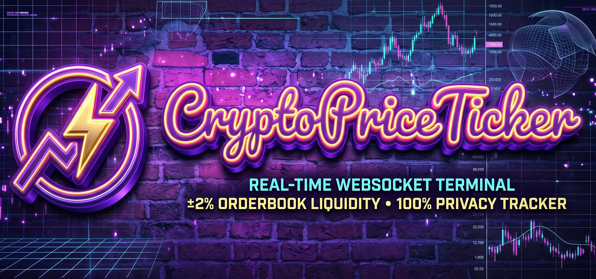
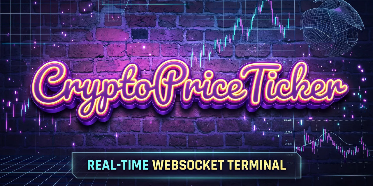
Logos, icons, badges, banners and colours, free for press, partners and anyone embedding our widgets. Please keep them unaltered and link back to CryptoPriceTicker.com.
The mark
A gold breakout arrow escaping a neon ring, with rising candles underneath. The arrow stands for the moment a price moves and the ring for the live feed that catches it. It is drawn as vector art, so it stays sharp from a 16-pixel browser tab up to a billboard.


Badges
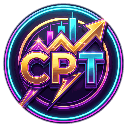
The illustrated CPT badges are made for stickers, avatars and splash screens. They have transparent backgrounds, so they sit on any colour.



Banners & social


Colour
Cool neons for the frame, one warm gold family for the arrow. Gold is reserved for the arrow and other "this just moved" moments. It is the only warm hue in an otherwise cool palette, and that contrast is what makes it pop.
- Midnight
#08051CBackgrounds, icon tile - Deep Indigo
#2B1366Tile glow, panels - Neon Magenta
#FF3FD8Ring start, sell candles - Electric Violet
#9B5CFFRing midpoint, depth - Cyan Pulse
#22E8FFRing end, buy candles - Signal Gold
#FFC63AThe arrow: the one warm accent - Ember
#FF7A1AArrow base, warmth - Spark
#FFF3B4Arrow tip highlight
Why it looks like this
Warm on cool, saturated on dark. Eye-tracking studies of colour salience find that warm, highly saturated colours draw the eye most, especially on black, and that strong figure–ground contrast increases how conspicuous something is. So the one element we want seen first, the gold arrow, is the only warm, high-luminance shape on a near-black tile.
One standout, not ten. The isolation (Von Restorff) effect only works when a single element differs from everything around it. If everything glows, nothing does, so the ring and candles stay cooler and dimmer than the arrow.
Shape carries the meaning, not just colour. A rising zigzag with an arrowhead still reads in greyscale and for colour-blind viewers. A dark keyline separates the arrow from the ring, so the two never blur together at small sizes.
Built for 16 pixels. Fine detail is the first thing lost in a browser tab, so the favicon is a separate small-size cut with no candles and heavier strokes. It carries its own dark tile, because Safari ignores dark-mode rules inside SVG favicons.
Usage rules
- Do leave clear space around the mark of at least a quarter of its width.
- Do use the favicon cut below 48 px and the full mark above it.
- Do link the logo to cryptopriceticker.com when you use it online.
- Don't recolour, stretch, rotate, outline or add effects to the mark.
- Don't place the transparent badges on busy photos where the ring gets lost.
- Don't use the brand to suggest that we endorse a coin, exchange or product.